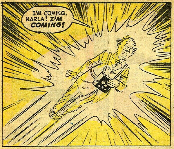
Translate

Thursday, August 31, 2006


Number 16


COVERING IT: Classic Golden Age Comics Covers Part 5


In the neverending quest of Pappy's Golden Age Comic Book Blogzine to overwhelm its readers with trivia and unimportant stuff about Golden Age comics, here is a cover to follow up on Pappy's #15 posting of "Ivan's Woe" by Howard Nostrand.

Bill Spicer published some of the earliest and most intelligent articles about comics, in one of the most professional formats. This issue, Graphic Story Magazine #16, published with a date of Summer, 1974, contains an interview with Nostrand about his career. At the time it was published he was out of comics, doing advertising art, but shortly after this re-entered the field. He did work for the very short-lived Atlas/Seaboard line of comics (Targitt), and then did work for Cracked Magazine up until his death in 1984.

This issue of Graphic Story Magazine also has some excellent comic art, reprinting a classic Bob Powell horror story, a John Pound EC satire, and even a Basil Wolverton story! A very eclectic issue of an eclectic fanzine, worth searching out.

Sunday, August 27, 2006


Number 15


Ivan's Woe


Swiping has a long tradition in the history of comic books. What it means to swipe is for artist John Jones to steal a figure, a pose, a gun, a tree, from artist Sam Smith, incorporate it into his own work in his own art style.

Howard Nostrand didn't swipe as much as he just appropriated the styles of two popular EC artists, Jack Davis and Wally Wood. Nostrand had a lot of stories published in Harvey Comics of the early 1950s, working in several genres. His work was especially close to Davis's.

It didn't take much examination to see it was more like Davis partially penciled by Wood. Nostrand was actually a very good comic book artist in his own right, as stories drawn in the 1970s show. The thing that struck me the most about his early '50s work was his amalgam of two artists who had completely opposite ways of expressing a panel. Davis was fluid, fast, laying the inks on lavishly, with heavy thick-and-thin brush lines. On the other hand, Wood was a fastidious artist, whose inking was almost fussy, done with much thinner strokes.

"Ivan's Woe" is from Witches Tales #23, 1954, is a knockoff of an EC story by Wood, showing knights in combat. Years later the story is told that Wood would pull tearsheets of Nostrand's story out of his files to show that Nostrand had imitated his layout, but drawn each figure in a different pose than Wood. Expressing originality while appropriating another's style is still a concept most comic book artists haven't mastered.

The story that is its influence, "Trial By Arms," appeared in Two-Fisted Tales #34, which had a cover date of July-August, 1953.

"Ivan's Woe" is curious. It was published in a pre-Code horror comic, but seems tame in comparison to the excesses of the era, and isn't as horrible as some stories published in the post-Code era. It has elements of satire (the title, a twist on a popular movie based on Sir Walter Scott's Ivanhoe), but isn't funny. It looks like some sort of strange hybrid that doesn't work in any genre, and defies being categorized. Still, artwise it's a fine example of Nostrand's style of the time, taken from other artists. Nostrand (who was born in 1932 and died in 1984) was young, only 21 or 22 when many of these stories were appearing. He worked as an assistant to the great Bob Powell. It appears that his inspiration, and his influences in comic art, were some of the best the era had to offer.


Thursday, August 24, 2006


Number 14


COVERING IT: Classic Golden Age Comic Book Covers, Part 4


Click on picture for larger image.

L. B. Cole was a cover artist who understood how to make his covers stand out on the newsstand.

This is one of my personal favorite covers from the Golden Age. As a crime comic it's kind of a bust, but it has two stories and cover drawn by Cole. He drew a lot of covers, but not a lot of interiors.

What the cover has to do with either GUNS or GANGSTERS I don't know. What it has to do with standing out on the newsstand with a pretty girl in high heels--underwater cheesecake, yet!--and a big, menacing shark popping out of the cover, I understand. I'm sure this was a big seller when it appeared in 1949.

Tuesday, August 22, 2006


Number 13

Walt Kelly's The Brownies in The Funnybody Kingdom

I don't think I can say much about the genius cartoonist Walt Kelly that hasn't already been said.

About all I can say is that he was liberal and progressive in one of the most repressive eras in our history, the early 1950s. Yet he got away with it, even with some savage satire of political figures, because of the sense of whimsy that permeated his work.

Pogo is his most famous work, but far from all of his work. It's his magnum opus, but not his only opus.

One of the books he worked on is the funny and beautifully drawn Brownies, Dell Four Color #244, dated April, 1949. While a lot of Kelly's work has been reprinted, I'm not sure if this story, "The Brownies In The Funnybody Kingdom" has…so if you've seen it before just enjoy it again. Otherwise you're in for a surprise when you read this story and its very Alice In Wonderland premise. Like Alice it ends enigmatically--was it a dream?--but while on the surreal ride this 15-page story takes us on it doesn't really matter, does it? It's the whimsy, the sense of fun, that goes throughout this whole story--really the whole comic book, entirely written and drawn by Kelly--that matters.


Monday, August 21, 2006

Number 12


 COVERING IT: Classic Golden Age Comic Book Covers, Part 3


Charles Biro did some intriguing covers for books he edited.Crime Does Not Pay was his brainchild, and he did most of the covers during its successful and notorious run.I like this particular cover, of Crime Does Not Pay #45, as much for what it doesn't show as for what it does. It doesn't illustrate anything from the inside of the book, just standing alone as a mini-story in one picture. Looking at it gives me more questions than answers.

Why is Nicki shooting into the closet?

Who is in the closet?

Who is the girl next to Nicki, and how does she know there's no one in the closet?

Is Nicki jealous of someone he thinks is in the closet?

Does it have something to do with the girl?

Why is Nicki wearing that godawful green suit?

Why is he wearing the suit with yellow socks?

Why doesn't the girl tell him he's badly dressed?

Why is "Nicki" spelled like a girl's name?

Is there someone in the closet he doesn't want the girl to meet?

Is Nicki someone who needs to come out of a closet of his own?

All of these are questions you could use to write your own story around this cover.

Wednesday, August 16, 2006


Number 11


Machine Gun Kelly


In the 1940s when crime comic books appeared in the form of Crime Does Not Pay, reading about gangsters and criminals was nothing new. Stories about lawbreakers go back as far as the beginnings of human society. What was new was putting them into a form accessible to children. Parental groups opposed to crime comics and even comics in general were around then, but got their public voice with Dr. Fredric Wertham, M.D., who got some steam up in his personal war on comics about the time this story was published, in Crime Does Not Pay #65, July 1948.

This is a story that ol' Doc Wertham would have loved to hate! George "Machine Gun" Kelly" and his wife Kathryn had already entered into legendary status after their crimes and arrest. They were still alive and in prison 15 years later when this story was published.

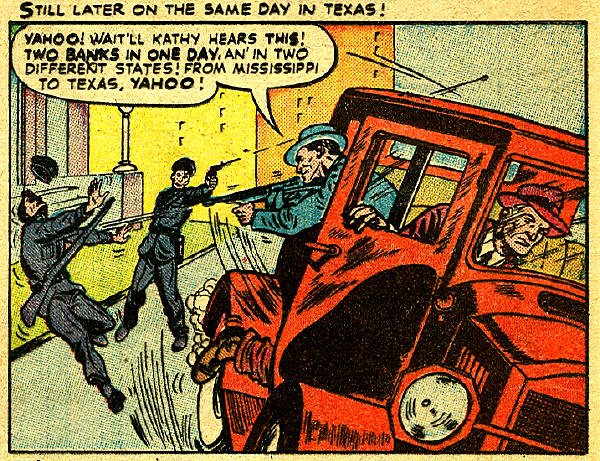
I don't know who wrote or drew the story. It's a cut above average, even for Crime Does Not Pay. Stories in that magazine were generally well drawn and written (even wordy for comic books). Nobody took credit. You sharp-eyed art spotters out there might be able to identify the artist.

The story might have been edited down to fit, but was for sure edited as to the name of the Kelly's kidnap victim, Charles Urschel, who comes out in this story as "Cashel." Even the pseudonym was edited from its original "Caschel," (probably considered too close to the real name). Whoever did the corrections missed a couple of speech balloons with the original spelling. Editing extended to the real-life arrest of the Kelly's, which was made while both were in bed, sleeping off a night of drinking. In the comic book version they are both standing up and dressed, a nod to the propriety of the times. Even though they were married, they couldn't be shown sleeping together. They could be shown shooting cops and flaunting the law for 7 ½ pages, but not in bed together.

(By contrast, "the Collins boys," on page two, could be shown in bed together.)

Kelly was reputed to have introduced the term "G-Men" into the language by yelling out, "Don't shoot, G-Men!" when he was arrested. I'm surprised the comic book story didn't include that.

Kathryn Kelly, who came from a criminal family, is shown as a bad woman, and you can tell she's bad because in every panel she's dressed in red. That was shorthand in those days. If you wanted to show a woman as a prostitute or gun moll just dress her in red, and voila, she's a scarlet woman. The panel of Kathryn with the cigarette hanging out of her mouth Wertham might have called an "image of comic book womanhood." The image of women didn't fare too well in crime comics.

Kathryn Kelly was to George Kelly what Karl Rove is to George Bush. She deliberately and carefully created his public image. In the Kelly case, Kathryn may be the first PR flack for a notorious criminal.


Monday, August 14, 2006


Number 10

The Lonely Life Of Homer Hergis


Years ago I was given a collection of stories cut out of various comics from the 1940s, '50s and into the early '60s. I had to go through the box and assemble pages into coherent order, which was a pain, since some of the stories appeared to have missing pages. With most of the stories there is no way to identify where they appeared or when. I just make educated guesses.

This is a complete 4-page story from Forbidden Worlds #81, 1959, by artist Pete Costanza and written by the editor, Richard E. Hughes, under one of his many pseudonyms (he didn't want his company, ACG, looking like the one-man operation it really was). OK, so it's not really a Golden Age story, but it's done by people who had their starts in the Golden Age. The art is quaint and 1940ish, especially when Costanza draws Karla, who looks like a science fiction babe straight out of an old Captain Marvel comic book (which he also drew)."The Lonely Life Of Homer Hergis" is a filler story, almost a throwaway, saved from total oblivion by the Costanza artwork. I hate this story, and after you read it--I'll give you time to check it out--I'll tell you why.


Back so soon? You caught me trimming my toenails with my teeth. Just let me put my teeth back in my mouth.

There. OK, I hate this story for the same reason I hate the famous Twilight Zone episode #8 with Burgess Meredith. Because the main character is a loner, because other people think he's weird. And because he doesn't deserve his awful and unfair fate.

Homer is a short guy (not his fault) and homely (also not his fault). He's like everyone else, just looking for love and acceptance. What happened? Rejection. Not just, "Gee, Homer, I can't go on a date with you because I'm washing my hair." No, the girl laughed at him, called him a "sawed-off two by nothing!" Who talks like that? Who would let a guy down in such a horrible way? I'm glad I don't know those women.

The problem is that when this story came out it was most likely read by boys 9-12 years old, and I'm betting about half those boys fit the general physical description of poor Homer Hergis.

No, Homer deserved to be recognized for his genius and to find a woman who would love him for himself, not just have an eternal round of rejection. He is even rejected by the one woman, Karla, who seems to love him only for his brains! The story ends with no hope, not for Homer, not for the pre-adolescent reader. Homer ends up a lonely, bitter old man whose genius didn't do him any good at all. By then the cynicism has completely taken over and Homer has lost all hope of ever being happy. And this was in a story sanctioned by the Comics Code! In its own way it's more of a horror story than some pre-code horror stories I've read.

Friday, August 11, 2006

Number 9

COVERING IT: Classic Golden Age Comic Book Covers, Part II.

These three classic covers of Tales From The Crypt, all drawn by editor/artist Al Feldstein, form a terrifying triptych of living guys and living dead guys.

These sent shivers through readers encountering these comic books for the first time in the early 1950s. They sent shivers of pleasure through me when I saw them for the first time ten years after their original publication. "These are neat-o," I thought, in my own unoriginal but expressive adolescent way.


Two of these covers (#22 and #23) are from my collection, and #24 is taken from the Internet. I was impressed by the lead story in #23, written and drawn by Feldstein, called "Reflection of Death." I first saw it in a Ballantine paperback reprint in 1964. The story embodies (get it? bodies?) those elements which brought EC Comics fame and infamy: graphic images of rotting corpses, lurching around in a grotesque parody of life. Booo-hahaha! I loved it then, I love it now.


Of the three covers, #24 seems to be the weakest, and not because of the drawing, which is typical Feldstein, straight to the point. Even though his figures were stiff (and his stiffs were figures!) his sense of design and graphic simplicity, with bold inking, made his covers stand out on the crowded newsstands. No, the reason I think it's the weakest is because when examining the cover, even when factoring in the you're-never-gonna-see-this-in-real-life sight of a corpse hauling a guy into a pool of quicksand, the victim isn't fighting back.


I don't know about you, but if some raggedy, stinking, rotting corpse was somehow brought to life and dragging me into a quagmire I'd be fighting back, with whatever means possible! I'd be scratching, kicking, punching and the whole time screaming like a little girl. I sure wouldn't have a neat suit and a tie that's still straight. By the time some zombie got me into the swamp we'd both be the worse for wear. I ain't going down without a fight, not even with a walking dead guy whose muscles have probably decomposed along with most of the rest of him.

Ah, but this is an EC COMIC, you say, and that excuses a lot. In EC Comics the writing was usually good enough, the plots compelling enough, the artwork sensational enough, that the reader would be sucked right into the fantasy. The best horror stories don't have to be probable, just carry their own kind of internal logic. It's kind of a satisfying fantasy, really--vengeance after death, that is--but it's available only in comic book stories like these. So once you get past that you can accept these stories as little cautionary tales, preaching to the readers in their own gruesome way that evil will be answered by evil. An eye-for-an-eye was never truer than in an EC Comic, where justice was done, even from beyond the grave.

Tuesday, August 08, 2006


Number 8

Don't Bury Me Deep

There's no room for subtlety in a 7-page comic book story, and especially no subtlety in a horror comic book story. Since the lead character is most likely going to get it in the end, it has to be made immediately known to the reader that whatever vengeance--from another character, or even from beyond the grave--is visited upon him, the butthead really deserves it.

"Don't Bury Me Deep" fits right into that category of horror story. It's drawn by Bill Everett, longtime stalwart of the Timely/Atlas Comics line, creator of Sub-Mariner, and illustrator of many a spooky tale for these Stan Lee edited books. It's from Adventures Into Weird Worlds #5.

Since "Don't Bury Me Deep" is about an undertaker, I hope you'll dig it. Har har har.